Thursday, 13 November 2014

Dadaisim

Brief History of Dada
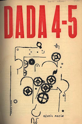
In the early 1900’s a group of rebellious artists disregarded art philosophies and academic teachings and even art itself, to persons a new way of perceiving reality in the Dada movement.
Emerging during the time of the First World War the Dadaists used tactics of shocking people to lure their blinded society out of their nationalistic and materialistic attitude which had led them to the ruins of World War One. These artists sought to deliver the truth- that what morals and political and aesthetic beliefs the people had built and developed on through the years were destroyed by the war, by encouraging catastrophic, profane and detached themes in their compositions. Since as a movement, they were quite radical to bringing about change and progress to their present situations, these artists had openly subjected the Expressionists to having resisted to the times with their sentimentality. Being a literary movement as well as a visual one, Dadaism was spread in various parts of Europe, such as Zurich, Berlin and Paris, as well as New York.

Dada Typography and Aesthetics of Meaning


Like the Futurism movement before them, Dada created this ‘typography revolution’ that was founded on the typography itself, were the type face was used as a way to communicate the creation of the meaning. In some other words, Dada removed all the graphic work from the conducted textual message. Dada didn't want the people to read and look “through” the words so to precept the meaning of the content, the movement wanted to enforce the people to look at the typography and on its exposed layouts and fonts.


Tristan Tzara, Une Nuit d’Echecs, 391 Paris !920                                                               


Hugo Ball,Karawane, 1917.
This version published the Dada Almanach, in Berlin in 1920. According, Raoul Hausmann, a Berlin Dadaist, Richard Hülsenbeck created the typography. The use of different type faces was a distinctive feature of the Berlin Dadaists.


In comparison to the Futurism typography, which outwardly aimed at an the interpretation of the ambition for speed, Dada’s typography, war technology, inherently multifarious, was suggesting a new way for deciphering the meaning of one that was eruptive and nonlinear and the most important self-sufficient of any fulfilled textual. Dada attached typographical weight to the words not according to its semantic sense in a statement. 

Covers, illustrations and Layouts of Dada’s Publications

Although the fact that Dadaists consider Dada movement not as an art but an anti-art movement, the designers of illustrations, layouts and book jackets in the Dada publications had a very strong artistic taste. Dada ignored the conventional aesthetics and instead offered a new viewpoint on it, and it also aimed the questions and the meanings of the meanings and it presented as a complete idiosyncratic idea.


Bibliography
https://www.papress.com/thinkingwithtype/teachers/type_lecture/lecture_images/DadaSoiree.gif


Sunday, 19 October 2014

Joan Miro

Joan Miro
Joan Miro I Ferra was born in 20th April 1893 and grew up in Barri Gotic near Barcelona, in Spain, and died at the age of 90 in 25th December 1983. He studied in the school of Escuela de Bellas Artes de la Llotja, and alson studied at Escuela de Arte de Francesco Galí, Sant Lluc , de Circulo Artístico from 1907 till 1913. He was in the Surrealism movment and also in the Dada movement. He is known best for sculpture, ceramics, painting, mural and illustrations, and he was also awarded the Venice Biennale Grand Prize for Graphic Work in 1954, Guggenheim International Award 1958, and the Gold Medal of Fine Arts, Spain in 1980.


Joan Miro’s illustrated work 


This is the illustration he made for the Cavall Fort. Cavall Fort is a magazine that comes out every two weeks for teenagers and children in Catalan.

In this illustration Joan Miro in my opinion sent a big massage to children and teenagers that one has to express himself freely like Joan Miro did here, he forgot the rules of the traditional artists. The fact that Joan Miro used basic colors and basic shapes which didn’t mess up the colors together it attracts more children’s attention and lead children to experiment with colors and shapes. I like in which way he left the shapes separate and spaced from each other, at first I thought it was messy and random but looking closely the kept it very neat and easy to read the name of the magazine.


I like the way that Joan Miro keeps the colors of the image very simple and although some people think that Miro’s painting a just simple and colorful after every picture there’s a story. Joan Miro said that ‘Less is more’ and that’s a good approach one must take. Joan Miro uses a lot of basic shapes but also uses strange forms of faces. He uses only flat colors and most of the colors are the primary colors. Miro uses many figures in his illustrations that seem like childrens imagination, he makes it very joyful and every one can understand it from children to adults.

"The spectacle of the sky overwhelms me. I'm overwhelmed when I see, in an immense sky, the crescent of the moon, or the sun. There, in my pictures, tiny forms in huge empty spaces. Empty spaces, empty horizons, and empty plains - everything which is bare has always greatly impressed me." Joan Miró. http://misskatyjonesillustration.blogspot.com/2011/05/joan-miro.html


Bibliography 


Monday, 13 October 2014

William Morris

William Morris


http://www.vam.ac.uk/__data/assets/image/0003/170139/hdr-william-morris-updated-415.jpg

Basic Information:

William Morris was born in 24th march of the year 1834 in Walthamstow England, and died at the age of 62, 3rd October 1896 in London England. William Morris was a textile designer, socialist activist, translator, writer (poet), and novelist. He was associated with the British Arts and Crafts Movement (Art Nouveau).While William Morris studied at the Oxford university there was a big influence of medievalism. After the university he worked as an architect, then W.Morris was married to his wife Jane Burde, and because of that he became friends with some Pre-Raphaelite artists that are: Dante Gabriel Rossetti, Edward Jones and a Neo-Gothic architect Philip Webb, infact William Morris and Philip Webb design a family house that’s called Red House. Then in 1861 Morris and his friends artist founded a decorative arts firm that was named the Morris Marshall, Faulkner & Co, they became high in fashion and demanding with W.Morris designing wallpapers, furniture, stained glass windows, fabrics and tapestries. Morris took the total control of the company in 1875 and then was renamed Morris & Co.


William Morris and Wallpaper Design

William Morris’s name and reputation cannot be removed from the history of wallpaper design, but he had a tendency to over-estimate the influence he was giving with the wallpapers in this field, but despite his belief in “art for all” his wallpapers were hand made by his company Morris & Co., so they were expensive to buy, and consequently had a bad fit on the clients, plus that they had a limited stock. His wallpapers were difficult to find in the market beyond fellow artist, and were disliked by Oscar Wilde and some other influential people. However he had a long lived effect on wallpapers design, creating designs which were enjoyed till lasting appeal.


http://www.vam.ac.uk/content/articles/w/william-morris-and-wallpaper-design/
'Trellis' woodblock printed wallpaper by William Morris, England, 1864. Victoria & Albert Museum, London


Inspirations
William Morris’s inspirations were plants themselves, observed from his walks in the country or his own garden and also pictures of plants, tapes-tries and illuminated manuscripts and other textile that had floral or leaf designs on them.
Morris designed over then fifty wallpapers and further forty-nine produced by J.H.Dearle, Kate Faulkner, George Gilbert Scott. Every wallpaper design had plant pattern whether expressed in a luxuriant naturalism (Acanthus, Jasmine, Pimpernel) more formal style (Sunflower). William Morris also printed on textile which in all he made over six hundred designs including designs on textile embroideries and wallpapers, over one hundred fifty stained glass windows. 


 Design for "Tulip and Willow" discharge wood-block printed fabric, 1873.
http://en.wikipedia.org/wiki/William_Morris


Cabbage and vine tapestry
http://en.wikipedia.org/wiki/William_Morris 


'Acanthus', wallpaper by William Morris, 1875. Victoria & Albert Museum, London